Images are usually the heaviest thing on any webpage. A single unoptimized hero photo can weigh more than all your HTML, CSS, and JavaScript combined. The format you pick determines whether that photo loads in 200ms or 3 seconds.
The problem is there are now seven credible options, and each one is good at something different. This guide breaks down when to use each format, where it falls apart, and how to convert between them without losing your mind.
1. JPEG: The Universal Standard for Photographs
JPEG has been around since 1992 and it’s still everywhere. It uses lossy compression, which means it throws away data your eyes probably won’t miss. Crank the quality to 60% and a 5MB photo becomes 300KB. Most people can’t tell the difference on screen.
The catch: every time you re-save a JPEG, it loses a little more. Open, edit, save, repeat, and after a few rounds you’ll start seeing blocky artifacts around edges, especially in text and high-contrast areas. But for photographs served on the web, it remains the path of least resistance. Every browser, every device, every email client knows what to do with a JPEG.
When to Use JPEG
JPEG works best for photographic content where transparency isn’t needed:
- Product photos on e-commerce sites where you’re balancing detail against page weight
- Hero images and banners that need to load before the visitor’s patience runs out
- Photo galleries where you’re serving dozens of images on a single page
Key Insight: A quality setting of 60-80% usually hits the sweet spot. Below 60% and compression artifacts start showing up in gradients and skin tones. Above 80% and you’re paying for pixels nobody can see.
Practical Implementation Tips
Always edit your source file (TIFF, PSD, whatever you have) and export to JPEG once as the final step. If you open a JPEG, tweak it, and save it again, you’re compressing already-compressed data. Do that three or four times and the image starts looking like it was faxed.
For bulk work, Picmal can batch-process an entire folder at a consistent quality level, so you’re not manually exporting one photo at a time.
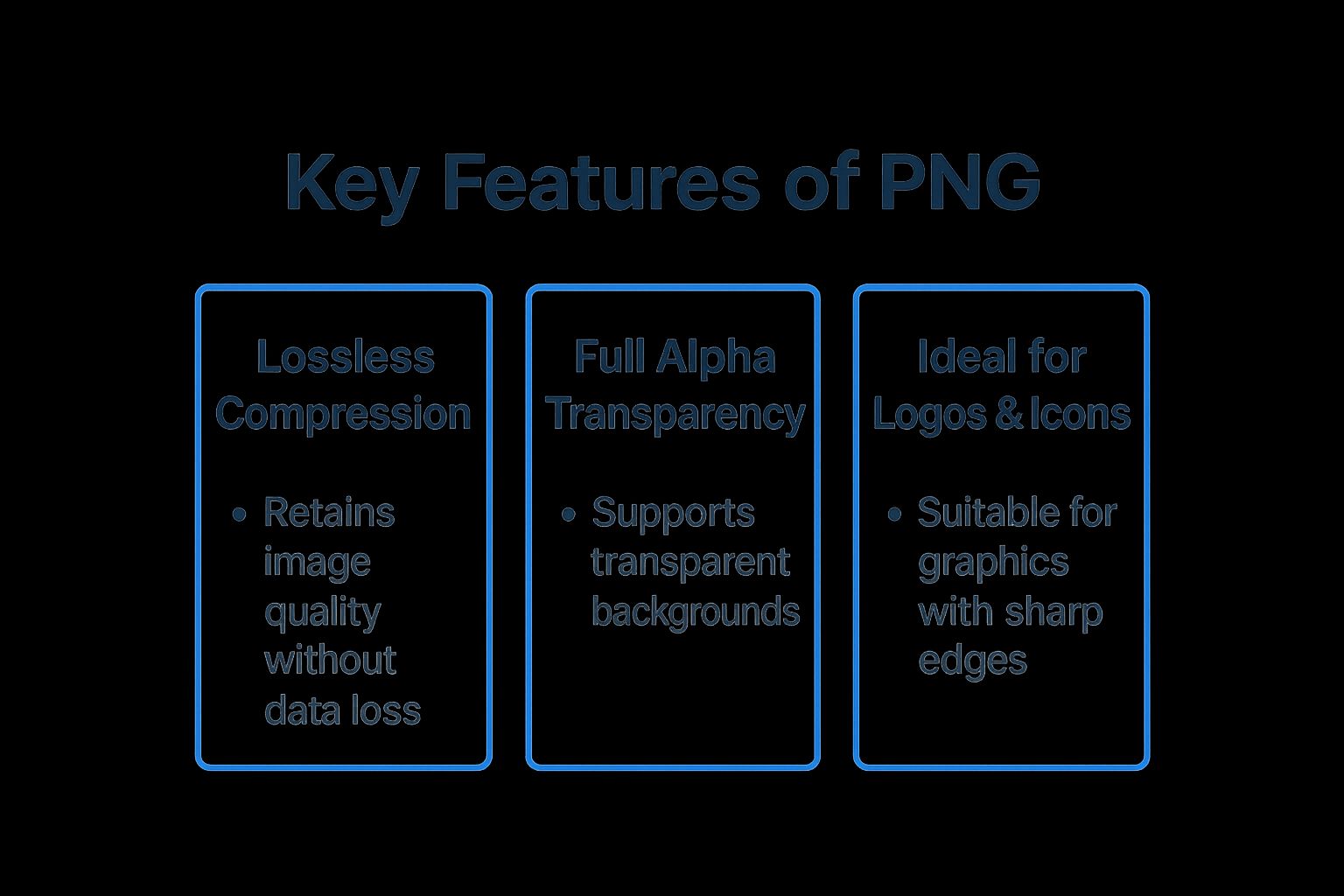
2. PNG: The Standard for Transparency and Sharp Graphics
PNG uses lossless compression: every pixel survives intact, nothing gets thrown away. The files are bigger than JPEG, sometimes much bigger, but what you save is exactly what you get back.
The reason PNG stuck around this long is transparency. JPEG can’t do it. PNG handles full alpha channels, meaning pixels can be partially see-through. That’s why every logo, icon, and UI element with a transparent background has been a PNG for the last two decades.
When to Use PNG
Use PNG when you need transparency or when the image contains sharp lines and text that lossy compression would smear:
- Logos and icons that need to sit on any background without a white rectangle around them
- Screenshots and diagrams where text must stay crisp and readable
- Infographics with charts, labels, and fine lines
- Illustrations and line art with solid colors and hard edges
Key Insight: PNG-8 supports up to 256 colors and produces smaller files. PNG-24 supports millions of colors and full alpha transparency. If your graphic only uses a handful of colors, PNG-8 can cut the file size dramatically.
Practical Implementation Tips
Don’t use PNG for photographs. A lossless photo can easily hit 10-15MB per image, which defeats the purpose. That’s JPEG territory.
Before uploading PNGs, run them through an optimizer like OptiPNG to squeeze out unnecessary bytes without touching the pixels. If you have a pile of them to prepare, you can batch convert images on Mac with Picmal to apply consistent settings across the batch.
3. WebP: The Modern Standard for Performance
Google built WebP to do what JPEG and PNG do, but with smaller files. It supports both lossy and lossless compression, plus transparency and animation. A WebP photo is typically 25-35% smaller than the same JPEG at the same visual quality.
In practice, WebP can replace both JPEG and PNG for most web use cases. It handles photographs, graphics with transparency, and even animated sequences (a better GIF, basically). With 98%+ browser support in 2026, the compatibility excuse is gone.

When to Use WebP
WebP makes sense for most web images today:
- As a drop-in replacement for JPEGs and PNGs across your site, shaving 25-35% off page weight
- On high-traffic or e-commerce sites where every kilobyte saved multiplies across millions of page views
- For short animations where GIF would produce bloated files with washed-out colors
Key Insight: The remaining 3% of browsers that don’t support WebP are almost entirely legacy IE and very old mobile browsers. Unless your analytics show meaningful traffic from those, WebP is safe to use as your primary format.
Practical Implementation Tips
If you still need to support older browsers, use the <picture> element to serve WebP with a JPEG fallback:
<picture> <source srcset="image.webp" type="image/webp" /> <source srcset="image.jpg" type="image/jpeg" /> <img src="image.jpg" alt="Description" /></picture>Picmal can generate WebP versions from your source files in batch. A quality setting around 75-85 usually gives the best size-to-quality ratio. Some CDNs (Cloudflare, Vercel, Cloudinary) can also convert to WebP on the fly, but having pre-converted files gives you more control over the output.
4. AVIF: The Next-Generation Compression Powerhouse
AVIF is built on the AV1 video codec, and the compression numbers are genuinely impressive: files that are 50% smaller than WebP and up to 90% smaller than JPEG at comparable visual quality. It supports lossy and lossless compression, HDR, 12-bit color depth, and transparency.
The downside is speed. AVIF encoding is slow. Converting a large batch of photos to AVIF will take noticeably longer than the same batch to WebP. Browser support sits around 95% in 2026, with Chrome, Firefox, Safari, and Edge all on board (Safari was the last holdout). It’s no longer experimental, but it’s not as bulletproof as WebP yet.
When to Use AVIF
AVIF pays off most when you’re serving a lot of images to a lot of people:
- High-traffic sites where bandwidth bills are real and every kilobyte saved across millions of requests adds up (Netflix uses AVIF for their UI imagery)
- Photography portfolios where you want the smallest possible files without visible quality loss
- Product galleries with dozens of images per page on mobile connections
Key Insight: AVIF handles both photographs and graphics with sharp edges and transparency. It could eventually replace JPEG and PNG entirely, but the encoding speed penalty means it’s not a no-brainer yet.
Practical Implementation Tips
Same pattern as WebP: use the <picture> element to serve AVIF first, then fall back to WebP, then JPEG. Three sources, one <img> tag. The browser picks the best one it understands.
Picmal can batch convert your source files into AVIF (and generate the fallback formats at the same time) — it’s a native image converter for Mac that runs the whole job locally, so nothing gets uploaded.
5. SVG: Infinite Scalability for Logos and Icons
SVG isn’t really an image file. It’s code. Instead of storing pixels, an SVG file contains XML that describes shapes, paths, and colors as math. Open one in a text editor and you’ll see coordinates and curve definitions.

Because it’s math and not pixels, an SVG looks sharp at any size. Blow it up to fill a billboard or shrink it to a 16px favicon; no blurriness, no pixelation. And because it’s code, you can style it with CSS and animate it with JavaScript.
When to Use SVG
SVG is the right choice for anything that isn’t a photograph:
- Logos and icons that need to look crisp on Retina displays without serving a 2x raster image
- Data visualizations and charts that respond to hover states or user input
- Illustrations and diagrams where the file weighs a few KB instead of hundreds
- Icon systems where you can change colors with a CSS variable instead of exporting a new PNG
Key Insight: SVGs can be themed with CSS variables, which means a single icon file works in both light and dark mode. No duplicate assets, no image swapping logic.
Practical Implementation Tips
Design tools export SVGs full of junk: editor metadata, unused definitions, comments nobody needs. Run them through SVGO before deploying. A 15KB export often compresses to 3KB.
You can embed SVGs directly in your HTML (saves a network request) or use them in <img> tags like any other image. For sites with lots of icons, bundle them into a sprite sheet so the browser fetches one file instead of forty. More on SVG workflows and other formats on our blog.
6. GIF: The Enduring Standard for Simple Animation
GIF is from 1987 and refuses to die. It supports animation, which is the only reason anyone still uses it. The format is limited to 256 colors, so photographs look terrible, but for a short looping clip of someone giving a thumbs up, it works.
Technically, every other modern format handles animation better (smaller files, more colors, smoother playback). But GIF has something the others don’t: cultural momentum. Every chat app, every social platform, every Slack workspace knows what a GIF is.
When to Use GIF
Use GIF for short, silent, looping clips where universal compatibility matters more than quality:
- Reaction clips and memes on social platforms
- Loading spinners and simple progress indicators
- Quick tutorial clips showing a 3-second software interaction on repeat
- Subtle animated icons in UI elements
Key Insight: If your GIF is longer than 5 seconds or uses photographic content, convert it to a muted MP4 or animated WebP instead. The file will be a fraction of the size with much better color reproduction.
Practical Implementation Tips
Every frame in a GIF adds to the file size, so keep them short. Drop the frame rate to 12-15fps (nobody notices the difference in a reaction clip) and limit the color palette to what the image actually needs.
Picmal can convert video clips or image sequences to GIF with control over frame rate and resolution. For existing GIFs, Gifsicle is a command-line tool that strips unnecessary frame data and optimizes the palette.
7. JPEG 2000: The High-Fidelity Archival Format
JPEG 2000 was supposed to replace JPEG. It uses wavelet-based compression that produces better results at the same file size, supports both lossy and lossless modes, and loads progressively (blurry first, then sharpening as data arrives).
It never caught on for the web. Browser support has been inconsistent for over two decades, and by the time it improved, WebP and AVIF had already taken the spotlight. JPEG 2000 lives on in specialized industries where the web is irrelevant.
When to Use JPEG 2000
JPEG 2000 shows up in fields where “good enough” compression isn’t acceptable:
- Medical imaging where a radiologist needs every detail in an MRI or X-ray preserved exactly
- Museum and library archives digitizing documents that need to survive in perfect quality for decades
- Digital cinema where it’s part of the DCP standard for theatrical distribution
- Professional photography archives where lossless compression saves disk space without touching the pixels
Key Insight: JPEG 2000’s value is archival, not web performance. If you need mathematically lossless compression for a master copy, it’s one of the best options available. For anything that touches a browser, use something else.
Practical Implementation Tips
Don’t use JPEG 2000 for web delivery unless you have a very specific reason and a solid fallback chain via <picture>.
For archival workflows, convert your edited master files (TIFF, PSD) to JPEG 2000 as the final storage step. Picmal handles the conversion with control over lossless vs. lossy settings, so you can match the compression to your archival requirements.
Comparison of Top 7 Web Image Formats
| Image Format | Implementation Complexity | Resource Requirements | Expected Outcomes | Ideal Use Cases | Key Advantages |
|---|---|---|---|---|---|
| JPEG | Low to moderate | Low CPU, low memory | Good image quality with lossy compression | Photographs, complex images, web photography | Excellent compression, universal support, adjustable quality |
| PNG | Moderate | Moderate CPU, higher memory usage | Lossless quality, supports full transparency | Logos, icons, images requiring transparency | Perfect quality preservation, alpha transparency, no artifacts |
| WebP | Moderate to high | Moderate to high CPU and memory | Superior compression, supports transparency and animation | Performance-critical websites, mobile-first apps | Smaller files than JPEG/PNG, supports animation and transparency |
| AVIF | High | High CPU and memory usage | Exceptional compression, HDR, wide color gamut | High-traffic sites, HDR content, bandwidth-limited apps | Outstanding compression, advanced color support, royalty-free |
| SVG | Moderate (vector-based) | Low resource usage | Infinite scalability without quality loss | Logos, icons, charts, animations | Scalable without pixelation, small sizes, CSS/JS integration |
| GIF | Low | Low CPU, low memory | Simple animations with limited colors | Simple animations, social media, UI indicators | Universal animation support, easy to create and use |
| JPEG 2000 | High | High CPU and memory | Superior quality, lossless option, progressive | Medical imaging, professional photography | Better compression than JPEG, lossless mode, advanced features |
Quick Reference
There’s no single best format. The right choice depends on what’s in the image and where it’s going.
- Photographs: WebP with a JPEG fallback. WebP gives you 25-35% smaller files at the same quality.
- Logos, icons, line art: SVG. Scales to any size, weighs almost nothing, and you can style it with CSS.
- Graphics with transparency: Try WebP first. If it doesn’t look right (rare), fall back to PNG.
- Maximum compression: AVIF with
<picture>fallbacks to WebP and JPEG. Smallest files, but slower to encode. - Short animations: GIF for compatibility, WebP or muted MP4 for quality.
- Archival: JPEG 2000 or TIFF for lossless storage of master files.
Converting Between Formats with Picmal
Once you know which formats you need, the conversion itself is the boring part. Doing it one at a time in Preview or through an online tool takes forever on a big folder. Picmal is a native image converter for Mac that converts entire folders at once, handles all the formats above, and runs locally so nothing gets uploaded.
Already have the right format but the files are still too heavy? That’s a separate problem — see how to reduce image file size on Mac, or compress images on Mac to batch-shrink a whole folder without changing the format.
Frequently asked questions
What is the best image format for a website? For photographs, WebP with a JPEG fallback gives you 25–35% smaller files at the same quality. For logos and icons, use SVG. For maximum compression on a high-traffic site, AVIF with WebP and JPEG fallbacks.
Is WebP better than JPEG? For the web, yes — WebP files are typically 25–35% smaller than JPEG at the same visual quality, and WebP also supports transparency and animation. JPEG still wins on universal compatibility (email, old devices), so many sites serve WebP with a JPEG fallback.
Should I use AVIF or WebP in 2026? WebP if you want a safe default that works almost everywhere with fast encoding. AVIF if you’re serving a lot of images and want the smallest possible files, and you can absorb slower encode times. The two aren’t mutually exclusive — serve AVIF first, WebP second, JPEG last.
Which image format has the smallest file size? For photographs, AVIF, followed by WebP, then JPEG. For flat graphics and icons, SVG is usually the smallest because it stores math instead of pixels.